The Goal: Creating Images for a Statistics Questions
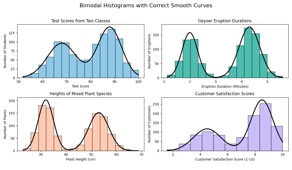
While I was working on some new statistics problems at Mathspace, I needed a bunch of specific images. The topic was about identifying the smooth curve that models a distribution, so I needed different kinds of histograms, like bimodal and skewed and different kinds of curves for the multiple choice images.
Making these by hand in a graphics tool would take way too long, and it would be hard to make them mathematically accurate. I knew this was a perfect task to automate, so I decided to use AI to help me write a Python script for it.
My Process: Vibe Coding with AI
I used Google AI Studio for this task. I started by giving it a sample Python script that already had the basic style I wanted. Then, I simply prompted it to revise that script to generate the specific histograms I needed for the questions.
It was really a "vibe coding" session. I guided the AI with the high-level requirements, and it was smart enough to handle the technical details, like using libraries such as Matplotlib and SciPy. In the end, we co-authored a reusable script that can quickly generate all the accurate statistical images I need for the problem templates.
Below is a sample python script output:
import numpy as np
import matplotlib.pyplot as plt
from scipy.stats import norm

# Set a random seed for reproducibility
np.random.seed(42)

# Create a figure with 4 subplots
fig, axes = plt.subplots(2, 2, figsize=(12, 10))
fig.suptitle("Symmetric Bell-Shaped Histograms for Problem Templates", fontsize=16)

# Common settings for all histograms
num_samples = 1000
bin_count = 15
alpha = 0.7  # Transparency for histograms

# Custom colors from hex codes
colors = ['#838EF0', '#60B2DE', '#19C9D6', '#03A28D']

# --- Version 1: Measurement Errors ---
mu1, sigma1 = 0, 1  # Mean and standard deviation
data1 = np.random.normal(mu1, sigma1, num_samples)
axes[0, 0].hist(data1, bins=bin_count, alpha=alpha, color=colors[0], edgecolor='black')
axes[0, 0].set_title("Measurement Errors (mm)")
axes[0, 0].set_xlabel("Error (mm)")
axes[0, 0].set_ylabel("Frequency")

# --- Version 2: Heights of Adults ---
mu2, sigma2 = 170, 8  # Mean and standard deviation
data2 = np.random.normal(mu2, sigma2, num_samples)
axes[0, 1].hist(data2, bins=bin_count, alpha=alpha, color=colors[1], edgecolor='black')
axes[0, 1].set_title("Heights of Adults (cm)")
axes[0, 1].set_xlabel("Height (cm)")
axes[0, 1].set_ylabel("Frequency")

# --- Version 3: Weights of Manufactured Products ---
mu3, sigma3 = 500, 20  # Mean and standard deviation
data3 = np.random.normal(mu3, sigma3, num_samples)
axes[1, 0].hist(data3, bins=bin_count, alpha=alpha, color=colors[2], edgecolor='black')
axes[1, 0].set_title("Weights of Products (g)")
axes[1, 0].set_xlabel("Weight (g)")
axes[1, 0].set_ylabel("Frequency")

# --- Version 4: Test Scores ---
mu4, sigma4 = 75, 10  # Mean and standard deviation
data4 = np.random.normal(mu4, sigma4, num_samples)
axes[1, 1].hist(data4, bins=bin_count, alpha=alpha, color=colors[3], edgecolor='black')
axes[1, 1].set_title("Test Scores (out of 100)")
axes[1, 1].set_xlabel("Score")
axes[1, 1].set_ylabel("Frequency")

# Adjust layout and save the figure
plt.tight_layout()
plt.savefig("bell_shaped_histograms.png", dpi=300, bbox_inches='tight')
plt.show()
Project Overview
AI-Assisted Code Generation, Python, Data Visualization, Statistical Modeling
Google AI Studio, Python, Matplotlib, SciPy