Excel Sales Dashboard
The Goal: Understanding Sales Trends
I created this simple analysis for a children's clothing company to help them see their sales trends more clearly. Because the real data is confidential, I used a fictional dataset for this version.
The main objective was to analyze the 2024 sales for a specific category:
- Dresses from the "Mini Miss" department.
- That were sold at a discounted price.
- And only from the online webstore.
My goal was to find out which months were lenient, moderate, and peak sales periods for these specific items.
My Solution: A Simple and Clear Dashboard
To present my findings, I built a simple dashboard in Excel. Instead of just showing a table of numbers, the dashboard uses charts and graphs to make the trends easy to see at a glance.
From the dashboard, we could easily see the key findings:
- Lenient Months: January to May had the lowest sales.
- Moderate Months: June to October showed average sales.
- Peak Months: November and December were the highest-selling months, likely because of the holidays.
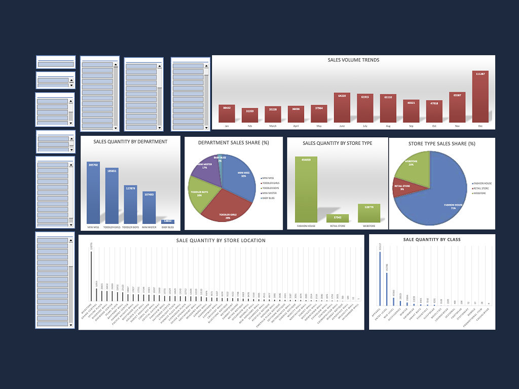
You can explore the interactive dashboard below:
Project Overview
Core Skills:
Dashboard, Data cleaning, Data visualization, Data Analysis
Tools & Technologies:
Excel
Project Link: